

Monday, May 20, 2013
America's Cup Watercolor Painting for WCN
I did this watercolor painting last year as part of a t-shirt graphic concept for a proposed America's Cup apparel line by West Coast Novelty. It was fun contrasting the bold red-orange of the Golden Gate Bridge against the vibrant blue of the San Francisco Bay.


Sunday, May 19, 2013
Apparel Design for American Crown- Spring 2013
I apologize for my long absence from the blog. I have been very busy over the past year and a half working as a designer at West Coast Novelty, where I have had the opportunity to do design and illustration work for WCN's American Crown destination apparel brand.
Here are some styles that I created last year that have since been produced and sold to Walmart stores nationwide. Check your local Walmart- some of these styles may be available for purchase at a location near you!
(These are all original designs for West Coast Novelty Group and may not be copied or reproduced in any way.)
Men's Mardi Gras 2013 Tees:


Women's Mardi Gras 2013 Tees:


Girls' Mardi Gras 2013 Tee:

Toddler Mardi Gras 2013 Tee:

Men's American Crown Spring 2013 Apparel:


Women's American Crown Spring 2013 Apparel:


Monday, July 23, 2012
CURRENT PROJECT: "Joy" Page 1
I recently completed an illustration for a lovely story, titled "Joy, about adoption and the special bond between families. I am working closely with the author, Susan Longley, to create a series of 12 illustrations to help bring her story to life as an illustrated e-book app.
Here is a sneak peek at the first page of the children's e-book, "Joy":

Here is a sneak peek at the first page of the children's e-book, "Joy":

Visit this link to the author's website for more information about this e-book, to learn about the author's personal experiences that inspired her to write this story, and to pre-order your own copy of "Joy."
Can't wait to share more with you all soon!
Thursday, June 28, 2012
NEW PROJECT: Adoption E-Book- "Joy"
I am pleased to announce that I have started working on illustrations for an e-book project with author Susan Longley.
The book, titled "Joy," is a story about adoption that has a great message, described by the author as being "about the spiritual connection between adopted children and their forever family." Since the author is self-publishing, she has started a campaign to help raise money to fund this project so she can move forward spreading the wonderful message of this book.
Visit this link for more information about this book and how you can contribute to the campaign.
I can't wait to share these illustrations with you all soon!
Sunday, June 24, 2012
A Little Lamb and a Lesson in Animal Ages
Every Sunday, I have the great blessing of teaching a class of five- and six-year-olds at my church. Today, our lesson was about how Jesus Christ is the Good Shepherd, so I decided to draw a picture of a cute little lamb for the kids to take home with them to help them remember what they learned at church today. I sure love those cute little lambs I get to teach every week!

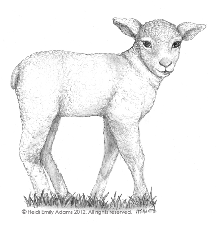
Lesson Learned: When drawing baby animals, be aware of proportions. Make sure you have accurate reference of the baby animal or your illustration may end up looking more like a miniature animal than a baby animal. Just like human babies, baby animals have a very different head-to-body size ratio. To keep your baby animal characters looking young, make the head bigger, eyes and ears larger and torso shorter than those of a grown animal. For sheep and other hoofed animals, make the legs skinnier and the coat shorter and softer looking than that of its adult counterpart. Add sweetness to your character by emphasizing eyelashes and hinting at a smile in the character's expression.
Monday, May 28, 2012
Academy of Art University Graduation and a Life Lesson
I had my official commencement ceremony from the Academy of Art University on May 25, 2012, earning my BFA in Illustration. Art has always been a passion and a favorite pastime of mine, but it is a brand new feeling to be able to call myself an "artist," knowing that I have finally achieved my lifelong dream of being able to do what I love as a career. Art school wasn't all fun and games- it was challenging, exhausting, and expensive (you can ask my husband all about that one). But in the end, the skills I learned, the inspiring people I met, the confidence I gained, and the lasting joy that comes from admiring and creating beauty every day make it worth every dollar spent, every critique endured, and every hour of sleep lost.
In the commencement ceremony, one of the speakers summed it up perfectly when he said that said we as artists are paid to do what we would do for free.

Thank you to all of my dear family, friends, and teachers who always supported my dream of being an artist. I couldn't have done it without you!
Lesson Learned: Follow your dreams- you won't regret it!
In the commencement ceremony, one of the speakers summed it up perfectly when he said that said we as artists are paid to do what we would do for free.

Thank you to all of my dear family, friends, and teachers who always supported my dream of being an artist. I couldn't have done it without you!
Lesson Learned: Follow your dreams- you won't regret it!
Friday, December 9, 2011
A Punk-Rock Zebra... and a Lesson in Animal Prints
For last week's assignment in my Wildlife Illustration class, I studied the Burchell's Zebra.


Here my character, Zoey the Zebra:

My orthographic studies:

And a realistic color study of a Burchell's zebra:

Lesson Learned: When illustrating an animal with a patterned coat, draw the stripes (or spots or patches) on the animal like you would draw a tight-fitting patterned piece of clothing on a person or a pattern on a vase, a bowl, or any other rounded object. Be sure that the pattern follows the curves of the animal's body, so that it does not flatten out the form of the animal's body.
Also, when designing a clothed character of an animal with a patterned coat, keep the clothing simple! Since the animal has a pattern all over its body already, solid colored clothing will help to keep things from looking too busy. For my zebra character, I played up the fact that her stripes reminded me of tattoo sleeves, and I put her in a leather vest to give her a punk-rock look that went along with her mohawk-like mane.
Wednesday, November 30, 2011
A Rhino in a Mini Skirt... and a Lesson in Animal Character Genders
Here are some orthographic studies I did of a white rhinoceros:

A realistic color study of a white rhino:

And a character, Rita the cheerleading rhino:

Lesson Learned: When characterizing wild animals, make sure that you note the gender differences within that species. In my research, I learned that female white rhinos can weigh up to half a ton less than males, and they also have a less pronounced shoulder hump and shorter horns than their male counterparts. This information helped me to make Rita look more feminine, and I will also need to keep those gender distinguishing characteristics in mind when I go on to design the guys that play football for the Rhinos.
Monday, November 21, 2011
Pre-Christmas Caribou... and a Tip for Painting Snow
In my Wildlife Illustration class, the module on antlered ungulates provided a great opportunity for me to prepare for the holiday season by learning to draw reindeer. My research taught me that, in the wild, they are called caribou... only domesticated caribou are called reindeer.


A little character, Rosemary the Reindeer
(created in Adobe Illustrator):
(created in Adobe Illustrator):

I think I will re-work Rosemary the Reindeer later on to dress her up for Christmas!
Anatomy studies of caribou:

A color study (painted in Photoshop):

Lesson Learned: Snow doesn't have to be white! When painting snow, think about all of the different colors that can be reflected in it. For my color caribou study, I added areas of orange and blue to the snow. These sunset colors reflected in the snow help to create a mood for the piece that is much more interesting than if the snow had been plain white.
Saturday, November 19, 2011
The Spectacled Bear... and Why the Obvious Solution is Sometimes a Good One
For my Wildlife Illustration class, I did a study of the Andean Bear, also known as the Spectacled Bear, because of the white rings around its eyes.


Here are the orthographic studies I did to learn the animal's anatomy:

And here is Spencer the Spectacled Bear:

Lesson Learned: Since this type of bear is known as the "Spectacled Bear," my immediate thought was to make a bear character wearing glasses. At first, I thought the idea was too obvious and non-creative, but once I started sketching I changed my mind. I think that the look of the bear with the white face and shaggy fur actually works really well for this older, more sophisticated bespectacled character that I created. Glad I went with my first instinct!
Tuesday, November 15, 2011
Planning a Picture Book... and a Lesson in Making Kids Look the Right Age
I've been working on an illustrated picture book for a story called "When You're Older," written by my friend James Littlejohn. I've been sketching for months now, and here is a little sneak peek of the picture book in progress- a mini storyboard of the overall layout of the book.


I'm still trying to decide what to do for the cover. I'm thinking of maybe showing the boy standing next to his mom and dad, but all you can see of his parents is their legs... to show that he is really little. What do you guys think? Any cover ideas?
Lesson Learned: Little kids have huge foreheads! The lower you draw the eyes on the head, the younger your character will look. In my original sketches, my character looked about 9 or 10. Then, I made his body shorter and increased the size of his forehead, and voila... he turned into a 3 year old!
Wednesday, October 26, 2011
An Indian Queen... and a Lesson on Enhancing your Portfolio
Last spring in my children's book illustration class, I started working on a version of "The Princess and the Pea" set in India. For the midterm for my portfolio prep class this semester, I got an opportunity to create a new piece for my portfolio, so I chose to illustrate the other half of a spread for "The Princess and the Pea" that I had started a few semesters ago.


Here is the finished illustration:

And the complete spread (along with the other illustration I did in the spring):

Lesson Learned: Every time you have an assignment for class, think about what you can create that will make your portfolio better. I could have illustrated a brand new concept or story for this assignment, but instead I decided to use it as an opportunity to strengthen a piece that I had already completed. The illustration of the princess in the rain was a strong portfolio piece on its own, but now when I open my portfolio to this illustration, the complementary illustration on the facing page finishes the spread and makes it look more complete. Plus, I got to introduce a new character and show my ability to keep a cohesive style throughout a series of illustrations.
Wednesday, October 12, 2011
Koala, Hare, and Fox... a Lesson on Fur
Here are a few more wildlife illustrations I have done lately:
Koala

European Hare


Koala

European Hare


Gray Fox


Lesson Learned: When illustrating furry animals, keep an eye out for the different colors within the fur. The animal will look more interesting if the fur has many colors in it.
Friday, September 23, 2011
Green Tree Frog... and a Lesson on Anthropomorphism
Last week, our lesson was on Reptiles and Amphibians. I decided to study the Green Tree Frog:


Orthographic Drawings:

Wildlife Illustration:

Character Design (Lilly the Tree Frog):

Lesson Learned: Pay attention to the details when anthropomorphizing animals. When designing the ballerina tree frog, I first asked myself- what do I need to include that will define this character as a tree frog? I decided that the essential elements to make it look like a tree frog are the skin and eye colors, the structure of the head and placement of the eyes, and the toe webs and pads. Then I asked myself- what humanlike characteristics does this animal have that can help me to anthropomorphize it? I decided that the hinged elbows and knees, humanlike muscular structure of the arms and legs, and the ankle bones are all aspects that I could work from to help make this frog more human-like.
Wednesday, September 21, 2011
Martina Koala... and a Lesson on Preliminary Sketches
For my first Children's Book Illustration 2 assignment this semester, I was assigned to interview a classmate and then come up with an illustration that somehow relates to 3 bits of information that I gained from the interview. I interviewed my lovely friend Martina, and from her responses I decided to illustrate these three points:
1. If she were an animal, she would be a koala.
2. Two words that describe her are: ridiculous and dramatic.
3. If she could go back in time, she would go back to when she was 5 years old, because she loved it.
So, here is my illustration of a ridiculous/dramatic koala in kindergarten:

Lesson Learned: Even after you have chosen the final narrative and composition for your illustration, sometimes the concept development can go even further. When I was refining my original sketch for this illustration, I placed a sheet of tracing paper over the original so that I could re-draw the koala's head in a different position and make the blocks look like they are starting to tumble. As I was drawing, I accidentally shifted the tracing paper a bit to the side. With the original drawing visible underneath, this created the illusion of animation- like the koala's head was moving and the blocks were falling. This sparked the idea to create this illustration as vector art, so that later I can go back and animate it in Flash! I plan on creating simple buttons (the blocks tumbling, Martina roaring, her classmate's head turning) that will transform this into a fun, interactive illustration!
So next time you start working on refining your sketches and other technical aspects of preliminary work, don't put your brainstorming to rest. You never know when a new idea might come up if you stay in a creative mindset throughout the entire process.
1. If she were an animal, she would be a koala.
2. Two words that describe her are: ridiculous and dramatic.
3. If she could go back in time, she would go back to when she was 5 years old, because she loved it.
So, here is my illustration of a ridiculous/dramatic koala in kindergarten:

Lesson Learned: Even after you have chosen the final narrative and composition for your illustration, sometimes the concept development can go even further. When I was refining my original sketch for this illustration, I placed a sheet of tracing paper over the original so that I could re-draw the koala's head in a different position and make the blocks look like they are starting to tumble. As I was drawing, I accidentally shifted the tracing paper a bit to the side. With the original drawing visible underneath, this created the illusion of animation- like the koala's head was moving and the blocks were falling. This sparked the idea to create this illustration as vector art, so that later I can go back and animate it in Flash! I plan on creating simple buttons (the blocks tumbling, Martina roaring, her classmate's head turning) that will transform this into a fun, interactive illustration!
So next time you start working on refining your sketches and other technical aspects of preliminary work, don't put your brainstorming to rest. You never know when a new idea might come up if you stay in a creative mindset throughout the entire process.
Subscribe to:
Posts (Atom)